Modernism & Post Modernism Poster Designs

Modernism          Post Modernism

The quote chosen for the Modernism poster is by Paul Rand and is “…It means integrity; it means honesty; it means the absence of sentimentality and the absence of nostalgia; it means simplicity; it means clarity…” These words are spoken in reference to the Modernism time period of graphic design. After the chaos previous to Modernism, it was natural for designers to want to make sense of the world and to design with order and clarity. Away went any decorative pieces of design and in came grids, blocks of color, sans serif fonts, and most importantly, simple and clean designs that wiped away any trace of the chaos surrounding them. I designed this poster simple and minimal, emphasizing the integrity and honesty. The colors chosen were ones that appeared often during this time period. Although I find myself designing everything with a nod towards Modernism, I had a slightly harder time creating this poster than the post-modernism poster.

The quote for the second poster came from a well-known post-modernist designer David Carson. It is “Don’t confuse legibility with communication. Just because something is legible don’t mean it communicates, and more importantly doesn’t mean it communicates the right thing.” He touches on this in the Helvetica film when he points at different words typed in Helvetica that did not show any emotion or any hint at what the word actually meant. Post-Modernists believe in making a statement. They use layers and text and photographs to convey a sense of irony or satire. This quote directly pokes fun at Modernism and their clean and clear way of designing. I chose to obstruct the legibility of “Don’t confuse legibility with communication” by layering more text on top of it. The picture used is poking fun at the Modernists by alluding to them being foolish. Some elements of the poster are rotated to throw off the balance of everything else.

Readings/Reflections

NY Times Hiring at Google Article

The first paragraph of this article is very intriguing from the start with the hiring manager of Google exclaiming that GPAs and test scores are worthless criteria for hiring someone. A common struggle of students from their junior year of high school up to their senior year of college is that they have a constant pressure to get good grades so they will be able to get a job and become successful. Why is it then, that one of the most prestigious companies is saying that what students have struggled with for many years is invalid?

According to Google, cognitive ability and leadership are what they look for in prospective employees. They also look for humility and ownership. Having the ability to learn quickly, know when to lead and when to step back, and when to take responsibility and have a sense of responsibility are the important things to Google. I think this is awesome. In order to have a well run company with employees that respect each other and their superiors, you have to have a team of people that can process when to step up, when to back down, when to know that they need to come up with an idea and also when to back down because someone else had a better idea. If everyone in the company can do this, then the company should run like a well-oiled machine. This is a very modern and smart way to hire employees.

Anyone can coast through school and manage to get good grades, but if you aren’t willing to learn in life and have a passion for what you are doing, college will not have helped you.

Link to article

Daily Heller Blog Post

Link to Blog Post

Scan-191

This post is about hand lettering and how it is sad that it is not as essential as it once was before. I have noticed though that hand lettering is becoming very popular over the past couple of years. I personally have a whole Pinterest board dedicated to hand lettering. What I love about lettering is that in this age of technology, we have the ability to take our lettering from a pencil and pen drawing to a digital vector version. This creates a huge possibility for hand made type. If you can’t find a typeface that fits your poster or whatever project perfectly then you can just go ahead and draw it up yourself! One of my favorite artists to look at is Lauren Hom, she has made a whole career out of hand lettering.

One comment on this particular blog post said that at the university she works at, they teach a “hand sign painting” class which I think is really cool!

Reaction to article on AIGA

Who Becomes a Graphic Designer? This is was very interesting article to read. To summarize quickly, a designer is not just one particular characteristic but a multitude of different characteristics. They are multiple different things because they  have a need to fulfill different interests. A designer is interested in language, how people interact with one another. They are interested in order, solving a problem by simplifying it or having a need to complete things. They are introverted whereas they can work by themselves for hours on end, but they are extroverted in order to work in groups and solve problems together.

In high school I did not know what I wanted to major in when I went to college, but I knew that I had a different view of the world around me. Instead of being the one creating conversation or the one taking over the lead of a project, I would sit back and watch. While watching I would learn so many things about the world around me and I would use what I learned to solve future problems. I think this helps me be a designer because I don’t necessarily focus mainly on making a project look good first, but how it will speak to or impact the viewer and how the viewer will connect with it.

Proposed Summer Project

This Summer I will be continuing work on my current independent project, the biology website with Dr. Schillo. Although I will not be at school and able to work on the web site, I will still be working on animations and graphics for each of the modules. Dr. Schillo and I will be keeping touch through email.

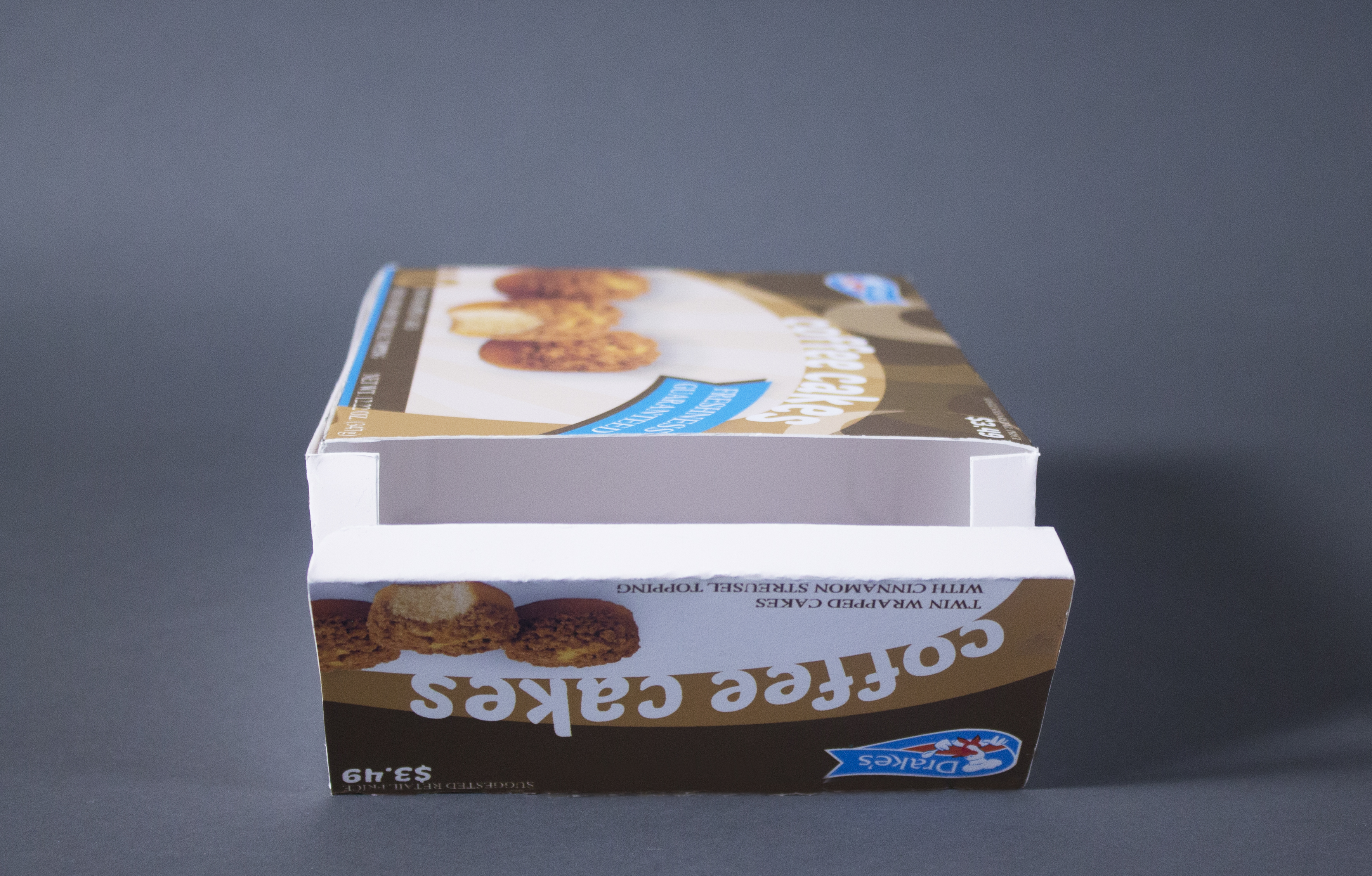
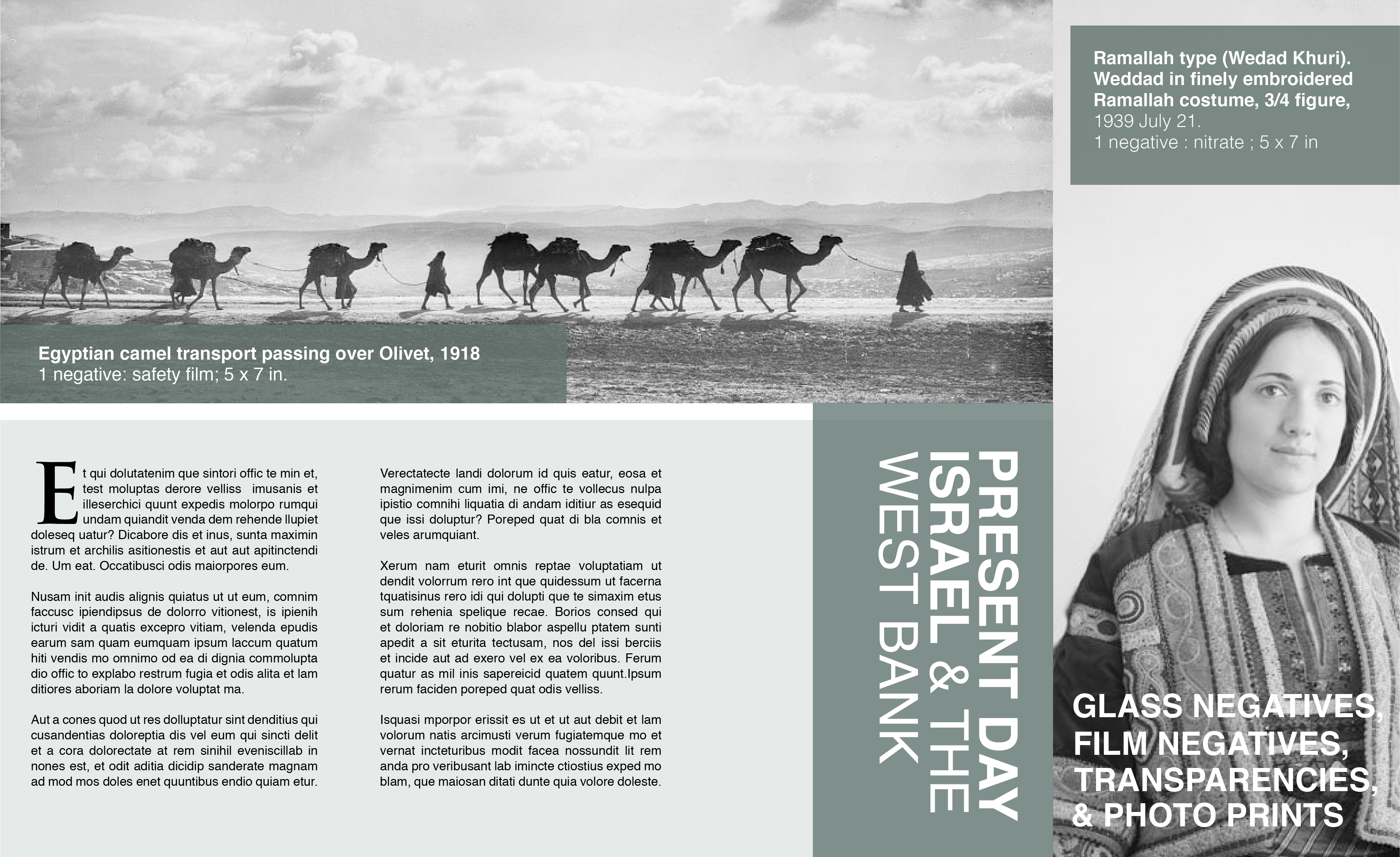
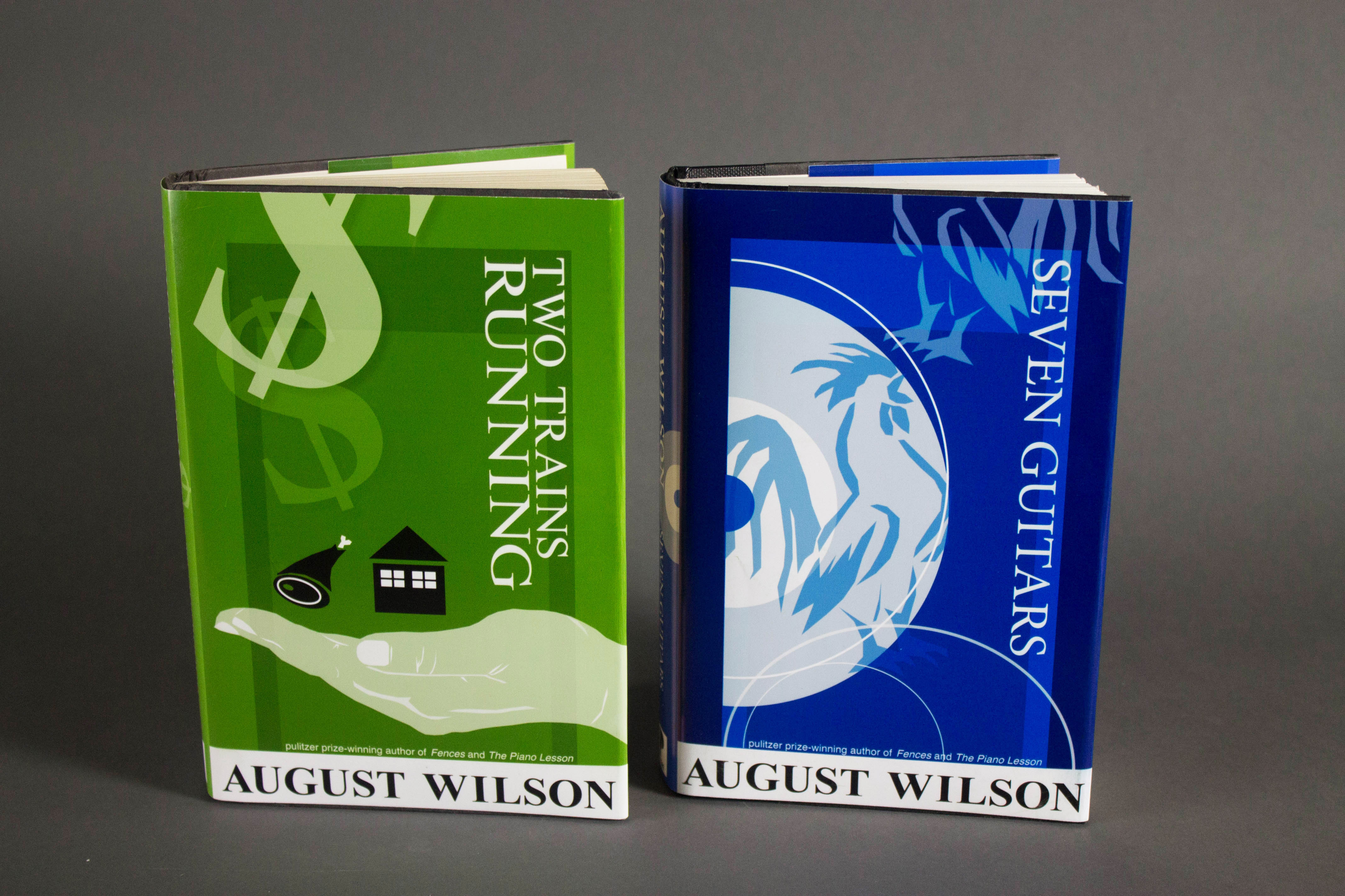
I have two personal projects I would like to work on. The first is building up my portfolio by replicating the projects we did this semester. I would like to make at least one more of the following projects: book covers, brochures, packaging (for a made-up company). The second project is a recent thought I have had running through my brain lately….I would like to hopefully get my own exhibition in the Project Space Gallery next year. With that being said, I have to come up with an idea and start creating pieces.

Taxes & Life After College

It is eye-opening to learn about taxes when working as a freelancer. Not only do you have to be the designer, but you have to be a business man as well or else you could run into trouble. I did not realize that the company you are employed by covers half of the taxes but when you are self-employed you have to pay double. That does make sense though, because you are now the employer and employee. It is very interesting to read about how you can get deductions on these taxes. I never would have thought that you could get 25% off of your rent if you use 1 of 4 rooms in your living space as a place where you see “patients.”

Jobs, Internships, etc

I’m not 100% sure what this section is supposed to be about so I’m going to write a reaction to the AIGA article “A guide to Internships.” One thing that stood out to me in this article was that an internship is a “test-drive” for a working environment that you may end up in at some point. I have always just thought of internships as ways to gain experience and knowledge and never looked at it through the lens of it being a test-drive! It is a very true thought though.

Final Packaging Photos

IMG_3647 IMG_3648IMG_3642 IMG_3645   IMG_3650 IMG_3655IMG_3653

The process of this project was a long and slightly frustrating one. I couldn’t for the life of me start this project because I just couldn’t think of any ideas. What was stumping me was that I felt I was bound to a certain color palette (unnatural blues and reds like the other popular brands -Hostess, etc.) that wasn’t inspiring to me. Once I started experimenting with the browns that complemented the coffee cakes, it started to come together.

The problems with the original packaging that I wanted to fix were the lack of a fun package since it had so much white space and not a lot of color, and I felt the overall packaging needed to be updated to a more modern look since the Drake’s packaging seemed less progressed than it’s competitors.

After completing this project, if I were to go back in a second time, I would make the Drake’s logo bigger (to satisfy the company) and I would make the stripes behind the coffee cakes on the front of the box darker since they barely show up which makes the front appear to have a lot of white space.

This was a very valuable assignment to have done since it involved actually constructing a physical package and making sure that the package had everything on it such as price, weight, nutrition labels, etc.

CT biz_hostess14.jpg

The Helvetica Film

helvetica

Modernist view: Wim Crouwel
Post-Modernist view: Erik Speikermann & Paula Scher

When Helvetica was introduced, it was this beautiful typeface that reflected order and efficiency, in contrast to all of the chaos that had come before it. Helvetica updated the old, homemade designs that were outdated. It instantly made them look orderly  and nice. Helvetica is clean, official, and efficient.

It’s quite interesting how there are such bold opinions of Helvetica, the designers in this film either hated or loved Helvetica and it was very intriguing to hear their thoughts. Even though I myself love Helvetica and believe it is a beautiful typeface, when the post-modernists talked about why they hated it, they started to sway my opinion! In the end though, they did not succeed and I will forever love Helvetica and the Modernist way of designing.

Wim Crouwel is a Modernist designer who speaks in favor of Helvetica. He says it is readable, straightforward, and has clarity. He says it is neutral, the meaning is found in the context of the text, not the typeface which was important for things like street signs.  The typeface needed to be efficient enough to capture the attention of the reader and guide them through street life, but not too distracting. Helvetica is simply there, it’s clean and orderly and does it’s job, the space between the letters, and the counters of the typeface, create beautiful relationships between black and white space.

Post-Moderist designers Erik Speikermann and Paula Scher have a much different opinion of Helvetica. Speikermann says Helvetica is like an army, it is too uniform. He believed typefaces are never perfect. He is fast, loud and chaotic when designing, the complete opposite of everything Helvetica stands for. Paula Scher went as far as relating Helvetica to the reason we are in war currently, it is the typeface is wars. She says she is morally opposed to the typeface because Helvetica was used during the Vietnam War and it meant you were in favor of the war. She said that Helvetica stood for corporate and that she had to over throw it.

I enjoyed this film and seeing all of the modernist and post-modernist artwork was very inspiring.

TheDieLine.Com Article Response

The article I’m responding to is titled: “Concepts We Wish Were Real” written on April 24th,  2015. What I liked about this article is that it’s a collection of student work which is interesting because it’s always neat to see what other students are doing with their art. The multiple packaging concepts from the students were very impressive and professional. Some common characteristics between each project that made them successful was the use of a simplistic design that is colorful and fresh and fun. That is how you are going to grab the attention of the consumer, by appealing to their sight and drawing them towards the brightly packaged products. Looking at each project, they all seem functional and realistic. My favorite project was the pet food packaging called “Nosh it.” The packaging is so simplistic yet so effective, appealing to the consumer who wants to give their pet a seemingly more natural and healthier pet food. The colorful characters on each different product are charming and memorable and helps to differentiate the products so consumers can remember which product they liked.

Screen Shot 2015-04-24 at 9.34.23 PM

Library of Congress Brochures

For this project, we had to make 3 brochures based off of different collections from the Library of Congress online database. The purpose of this assignment was to focus on making three brochures that looked like they belonged in a series with one another. We were to create three different types of brochures, I chose to do the gate fold, double parole fold, and the barrel fold. Important things to focus on were keeping enough space between the edges of the panels and the content inside, and making sure the text was an appropriate size and neatly manicured. For this assignment, I really wanted to strive to make these look professional and to make sure each panel looked good paired next to the other panels.

The three digital collections I chose were Farm Security Administration/Office of War Information, Carnegie Survey of the Architecture of the South, and Matson (G. Eric and Edith) Photograph Collection. I ended up choosing these three because of their striking black and white photographs.

Barrel Fold Template Barrel Fold Template2 Gate Fold Template Gate Fold Template2 ParallelFold ParallelFold2

Event Promotion Peer Review

Event

For the peer review, I chose Lindsey Johnson’s poster. I chose this one because I liked how her design grew from her original idea: Direct link to her first idea here (https://lindseyljohnson.files.wordpress.com/2015/02/cart-308_johnson_poster.png). I think that the final submission is a successful poster and I personally relate it to Oneonta because it’s always raining or snowing here!!

The overall concept of art students being different from the crowd is cute and I like how she depicted this with the bright umbrella. The matching colors in the typography was a good idea as well. The only thing I would change would be to have maybe a gray background or a faded graphic behind the text because the artwork seems cut off abruptly from the rest. She did say that this was on purpose to separate the text and artwork but I just wonder what it would look like if done otherwise. Maybe if she had one big umbrella behind the text it would look different. Overall I think this is a clever poster and I really enjoy it!

Packaging Book Writeup

While reading through the book “Packaging Essentials” by Sarah Roncarelli and Candace Ellicot, the section titled “Form Defines Function, Function Defines Form” caught my attention. This section talks about how a designer needs to keep in mind the consumer they are trying to sell to when they are thinking about what type of package they use. It mentions that older consumers need easy-to-open packages which this is something I never really thought about. It makes sense that when people get older they will have a harder time opening packages, such as an elderly woman who is too weak to rip open a box.

Something else that I thought was interesting from this little section of the book was that it suggests that a designer “tracks the product through its life span” by envisioning the package from its concept, to manufacturing, to having it on the shelf, and in the end how the consumer will “interact with it after purchase.” This is good advice because if you think about all of these things from the beginning then you are more likely to create a successful package that will satisfy the customer’s needs in all ways.

Research Questions for Packaging Project

The category I was assigned was: Candy, Snacks, and Beverages.
I decided on redesigning the packaging for Drake’s Coffee Cakes.

coffee-cakes-boxlogo

What are the products they are shelved with?
This product is shelved with mini muffins, twinkles, and other cupcake/cake like packaged snacks.

What is the packaging of these products like?
The packaging for these products are mostly illustrative and include characters. The product name is usually large and prominent on the package, and the colors used are mostly red and blue,

What do they have in common. Is there a general personality for these products?
The general personality for these products is a fun and happy one.

Do you see certain elements or motifs repeated amongst the products?
The characters and illustrated background are repeated amongst the products.

Amongst the products it is shelved with, which is the nicest example of packaging of this type of product?
(I have to go back and check this out a little more)

Is there a package there that is innovative and shows a greater emphasis on design?
None of the other products really stood out as being more innovative or more designed.

Is there an established color scheme that consumers are familiar with for this type of product?
I have noticed that blue and red are common colors for this type of product, I’ll have to look into why this is.

What are the established branding conventions of the graphics that are too important to loose in a redesign?
I think the characters that were made for the different products are too important to change. Drake’s coffee cakes doesn’t really have a character besides the duck logo.

What typography conventions are used?
The name of the product seems to usually have no fill or a yellow fill with a thick (red) stroke. The letters are usually placed tightly next to one another.

Is there a package that is engineered in an innovative and inspiring container?
Most of them are just in plain boxes, there are no innovative ones.

Is it an areas of consumer goods that seems to be embracing new and innovative packaging?
I do not think so.

Is there an example that seems to be stuck in an older era of packaging and needs new design?
I think that Drake’s seems to be the one that needs most improvement. It doesn’t seem as fun and captivating as the other products.

How many different substrates (material the package is made of) can you notice?
It is made out of only one substrate (cardboard?).

How many different specialty printing methods (foil, embossed, debossed) can you notice?
There are none.

Four Questions about the Book Jacket Designs (& Finished Design)

Both Front Both Spine Landscape

Here is a pdf of all of the photos taken of the finished product! Book Jacket PDF

What is Your Concept for the Book Covers?:
In Two Trains Running, the main concept of the book is that African Americans face economic injustice in the North. The two big objects being held back from the characters of the book are a ham that was promised to one man in which he never got, and a restaurant that is going to go out of business, and those two things are depicted being held in a hand on the cover of the book. This is symbolism of those two things being controlled by the white man.

For Seven Guitars, the book is mainly about the struggles of African Americans not being able to prosper in their careers in the North (Mainly Floyd and his career as a blues musician). There is a recurring symbol of a rooster in the book which is a reinforcement of the struggle of those in the North that are believed can only prosper in the South (the rooster is said to have been an Alabama rooster living in the North and it ends up dying (symbolism)). That is why on this book cover I included the record and rooster symbol.

Moment that stood out in book for design?:
Like I mentioned before, the symbolism in the books is what stood out most to me and that’s what I wanted to depict on the covers.

Reason for Colors Chosen?:
I chose to make the Seven Guitars cover a deep blue color to reflect the style of music the main character plays. Two Trains Running has a green cover (suggesting money) because the whole book represents economic injustice.

Why would the buyer be interested in these books?:
I hope that the buyer would be motivated to purchase these books based on the illustrations and color of the book jackets.